My focus of this week was completely recreating the website. I used the main steps of the tutorial I watched last week and I made the website unique.
First, I created a completely blank new sub-domain so I wouldn’t worry about messing anything up on the one already created and also in case I did not like the new website created.
Elementor, the plugin I used, is based on a page of block segments that flow together to create a page.
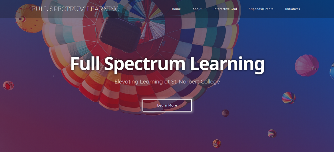
Each main page (except the main page) has the same picture heading. On that picture heading there is a column background heading that features the gradient from red to blue that is used in the color grid.
This is what it looks like:

Each page is very similar but a bit unique. There are two consistent fonts used throughout the website: Noto Sans for headings and Quicksand for the body text.
I also added some animation to headings and buttons to give the website a bit more depth visually.
There are three similar but different versions of the site: desktop, tablet
There are a few minor things I have to fix and create yet on the website. There are a few padding and margin issues on the mobile version still. The two main projects for me will be creating the course pages and also creating the Full Spectrum Learning Stipend: Exploration and/or Implementation details page.
Please check the website here!